From magical flower of witches and sorcerers, to color of the year 2022. Discover the reasons that led Pantone to choose Very Peri as the dominant color in the next turn of the page in the calendar.
Read the future in color
A reflection of multiple influences – some of which are unnameable – the color of the year tries to capture what the French call l'air du temp and in German it is coined as zeitgeist and that we can translate as signs of the times we live in and the way they are culturally reflected. Using color theory to interpret trends, fashions, socio-economic orientations, global politics, and cultural and artistic leanings is a way of reading the future, finding clues about how things might turn out, and predicting other trends.
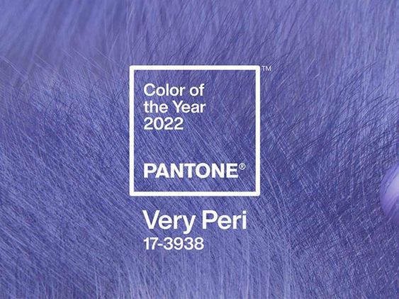


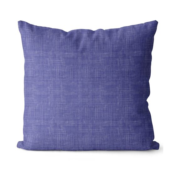
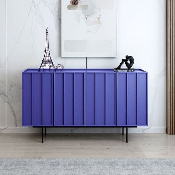
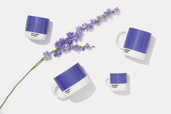
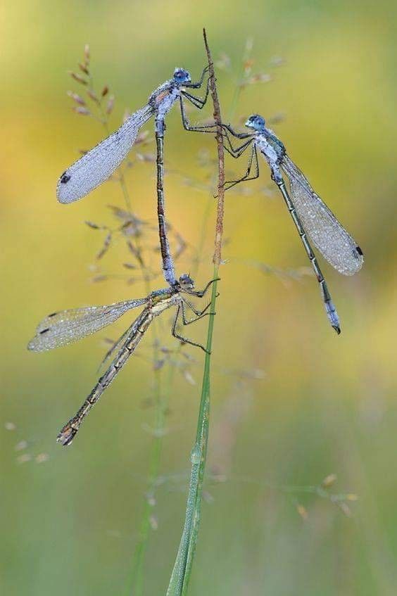
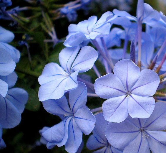
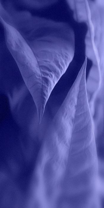
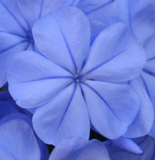
The Very Peri tone, which chromatically will define 2022, takes its matrix from the blue-purple flower of the periwinkle plant – sought after by magicians, healers and medicine for centuries – and aims to capture the moment of transition through which the planet, in global and globalizing, is passing. Marked by the pandemic, by long periods of forced or voluntary closure, managed by fear, we now live even more in the virtual sphere, trapped in the electric blue glow of the monitors of a world increasingly concentrated in the digital sphere. A spectrum of colors that extends those previously existing in nature and that led Pantone, for the first time – in the 22 years that the Pantone Color Institute took to define the color of the year –, to create a root color. He called it Very Peri, a dynamic blend of periwinkle blue with life-giving undertones of reddish violet. This mixes, according to Pantone, “the fidelity and constancy of blue with the energy and emotion of red.” A shade that pays homage to the aforementioned periwinkle, the wings of some insects or our rustic hydrangeas easily reproduce in different gradations, with more or less blue, with more or less red, or even with the exact composition of the new Pantone color. We all know how Nature is a master in the art of creating anything, in any chromatic spectrum, we just go after it.
The guru, the real, the virtual and even Plato
“As we emerge from an intense period of isolation, our notions and patterns are changing, and our physical and digital lives merge in new ways”, Pantone also clarifies, by the hand of Laurie Pressman, vice president of the Pantone Color Institute, mentioned in the press release that has already gone through all the newsrooms on the planet, which are always looking forward to the annual revelation. One of the results of the pandemic phenomenon that Laurie talks about is the enlargement of the plane – time and space – that we now inhabit and where all limits can be broken, crossed and reinvented virtually. Creating new colors is one of those infinite possibilities and it reflects well the present and the future of our era.
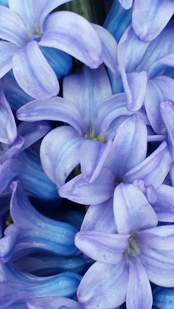
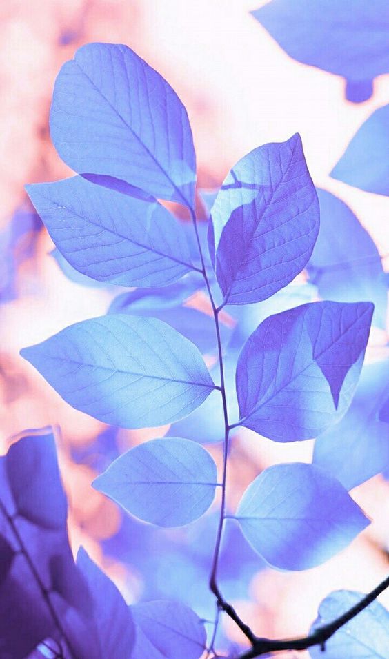
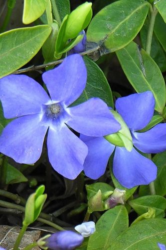
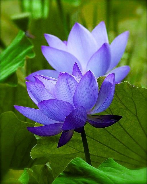
“The Pantone Color of the Year reflects what is happening in our global culture, and expresses what people are looking for and what a particular color can aspire to provide.” Although it may merely be fixed in the conceptual or spiritual context, finding an answer in colors is a behavioral and intuitive pattern operated by the mind, when it seeks landscapes and images of escape, with appeasing or inspirational purposes, for example. Nature is the normal destination of this observation and these searches, but faced with the deprivation of freedom of movement, we resort to the virtual substitute, to the digital space, to our new 'Allegory of the Cave', by Plato, with the difference that - so if wants – we still know how to distinguish the real from the virtual the off line. do online.


Laurie Pressman goes on to clarify the reason for this year's choice and link the chosen shade to the present: “The creation of a new color for the first time in the history of our PANTONE Color of the Year educational color program reflects the innovation and global transformations that are taking place. As society continues to recognize color as a critical form of communication and a way to express and affect ideas and emotions and to engage and connect, the complexity of this new shade of blue infused with red violet highlights the expansive possibilities that lie ahead before us.”
Surgically optimistic
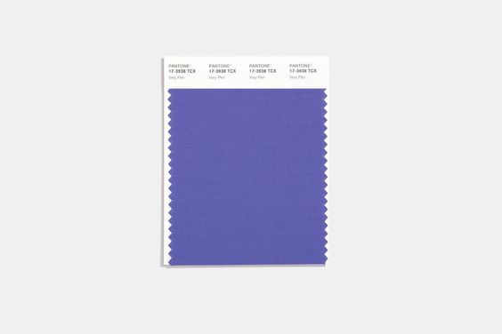
Looking into the future entails serious responsibilities and Pantone seems well aware of its role in the face of the 'crystal ball'. Therefore, it promotes a positive, encouraging and inspiring perspective that drives us forward, with courage and joy. So, based on color psychology, he sends us to 2022 with the “carefree confidence” of blue and the “sassy curiosity” of red and mixes them in the Pantone 17-3938 Very Peri hue, his full name, with the which challenges us to rewrite our lives. The purpose is to uplift the spirit, promote discovery and encourage creativity. Only in this way can each of us and, with us, the world advance, trusting in progress, in science and in the human soul.
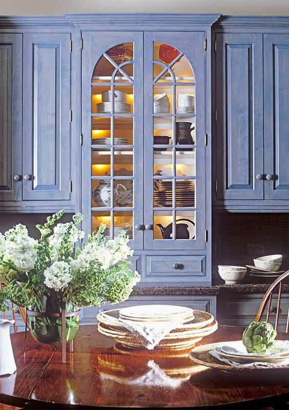
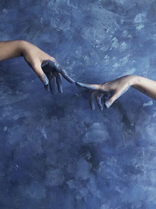
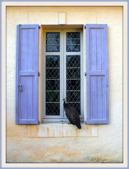
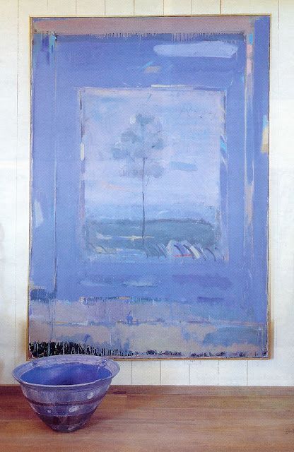

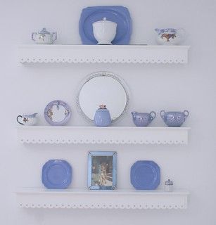
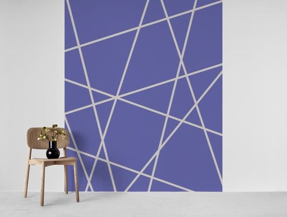
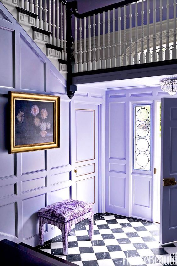
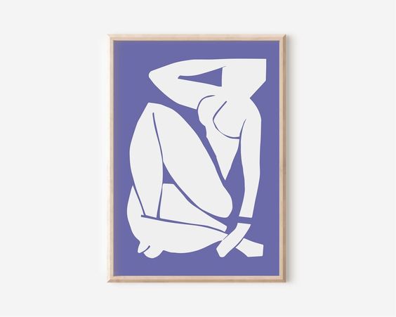
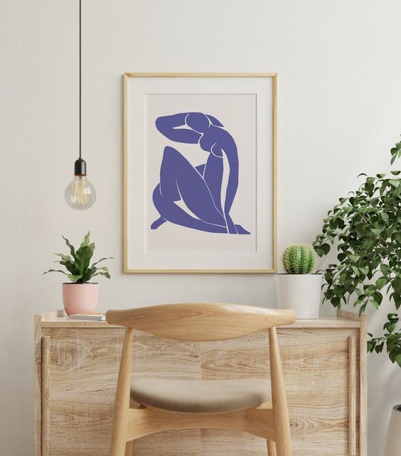
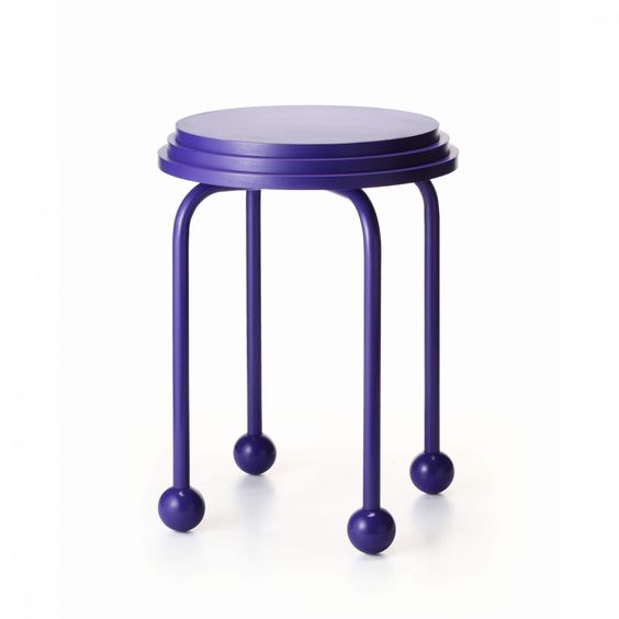
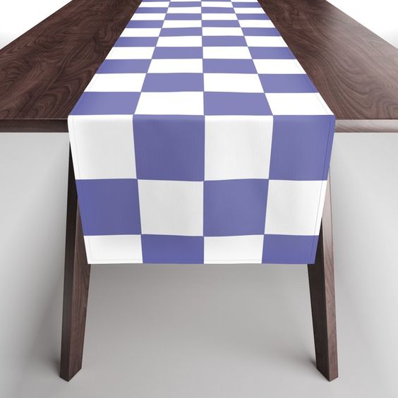
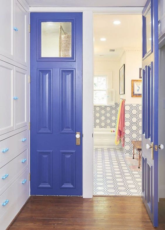
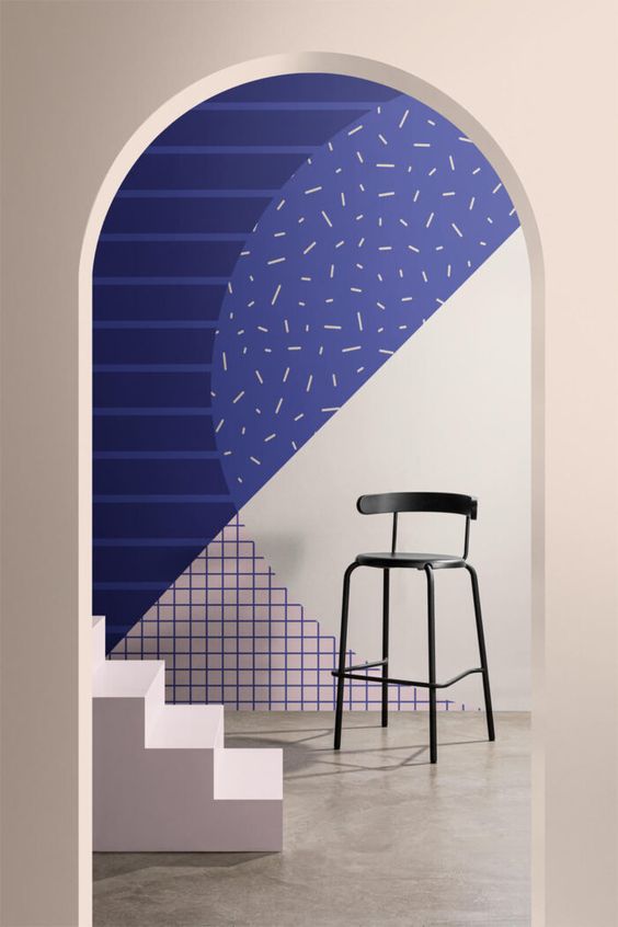
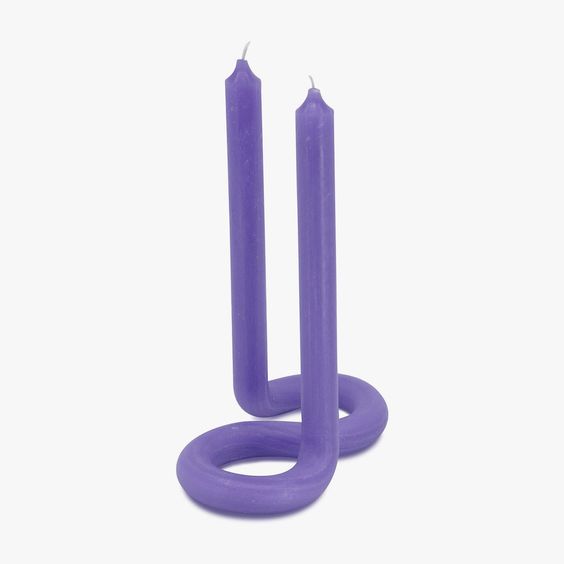
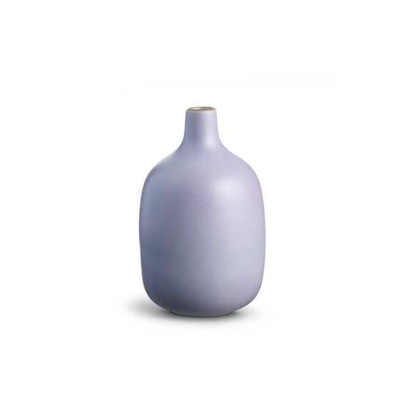
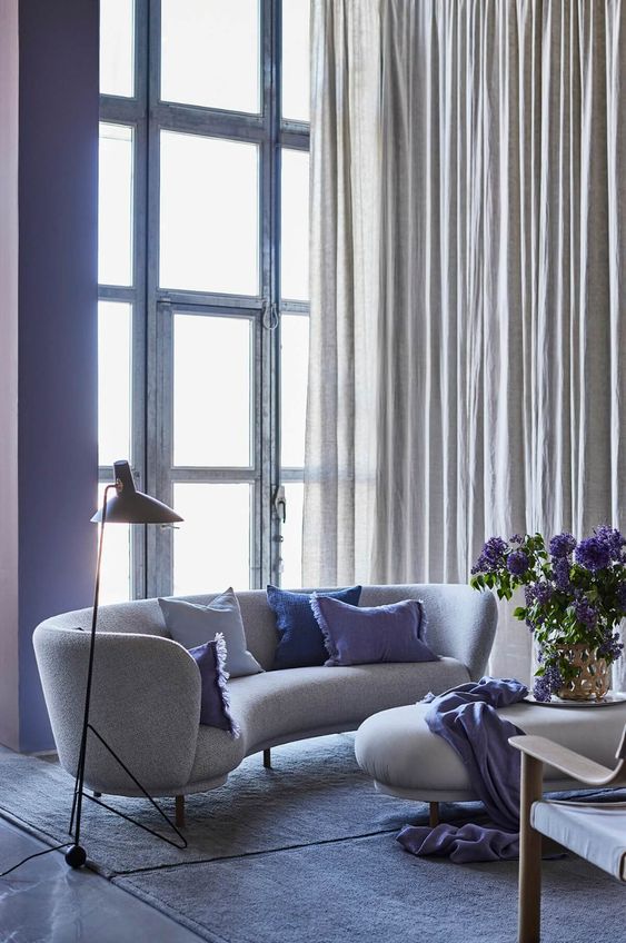
What is now certain is that Pantone's annual verdict will chromatically determine the year 2022, with even stylists and designers awaiting the decision to 'paint' their creations. It always takes some time before we incorporate a new trend, in this case, a new color, so we leave motivational and inspiring images and even ways to visualize possible paintings at home and ways to use notes from the brand new and debuting Very Peri.
Although not everyone is enchanted by the new color, we can get around its chromatic and visual physicality, without ceasing to paint our life with enthusiasm, still brushing it with curiosity and creative spirit, 'natural pigments' without which any future will always be boring and uninspiring.
Finally, we recall that Very Peri succeeds the duo Ultimate Gray and Illuminating Yellow from 2021.
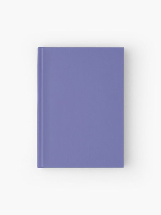
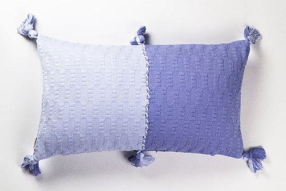

Photography – Light It Be and Pinterest


0